NAKANOKE & SONS
From 2014 to 2019, I co-owned and created all the graphics — and did just about everything else apart from developing the recipes — for this gourmet salsa company.
Mexico is filled with salsa brands, many of which have traditional Mexican names. This product was born from the confluence of three cultures: a Japanese grandfather and a Spanish grandmother who made a life in Mexico City, so I designed a non-traditional name and branding for this Mexican salsa.
ROLEArt Director
Brand Designer
Packaging Designer
Marketing
Sales
THE NAMEWe wanted a name that played with legacy, tradition and irreverence. The chef's family has a strong tradition in the Mexico City food industry — his grandparents created the Japanese Peanut, and he wanted this new brand to branch off this heritage. The name NakaNoke combined his surname (Nakatani) and my nickname (Mononoke). The “sons” were three shiba inu dogs.
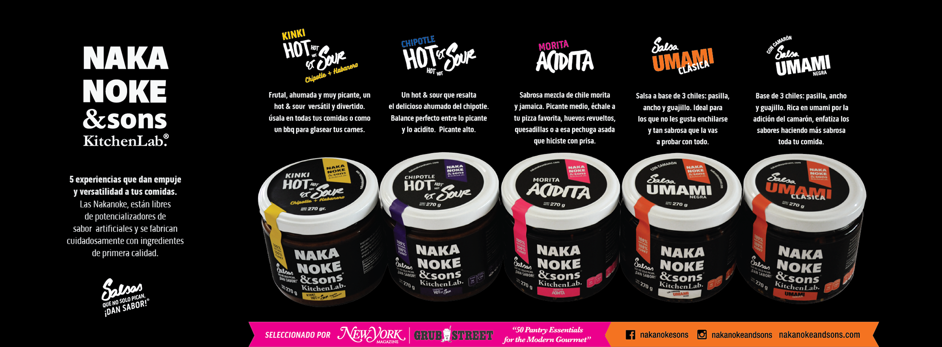
PACKAGINGIt needed to be as clear, simple, and unusual as the product itself. Using black as our main palette, I designed a different logo for each of our five flavors and distinguished them all with bright contrasting colors.
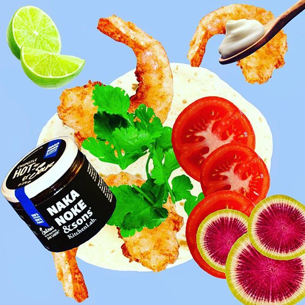
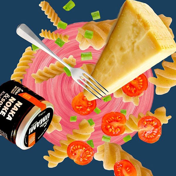
RecipesSince this was not a traditional Mexican salsa, customers often asked how to use the product. We wanted it to be used in almost any dish, so I decided to put the recipes in simple collages with daily ingredients — the idea was to make our product as accessible as possible. The recipes were published on our social media and printed as gifts for our online buyers.


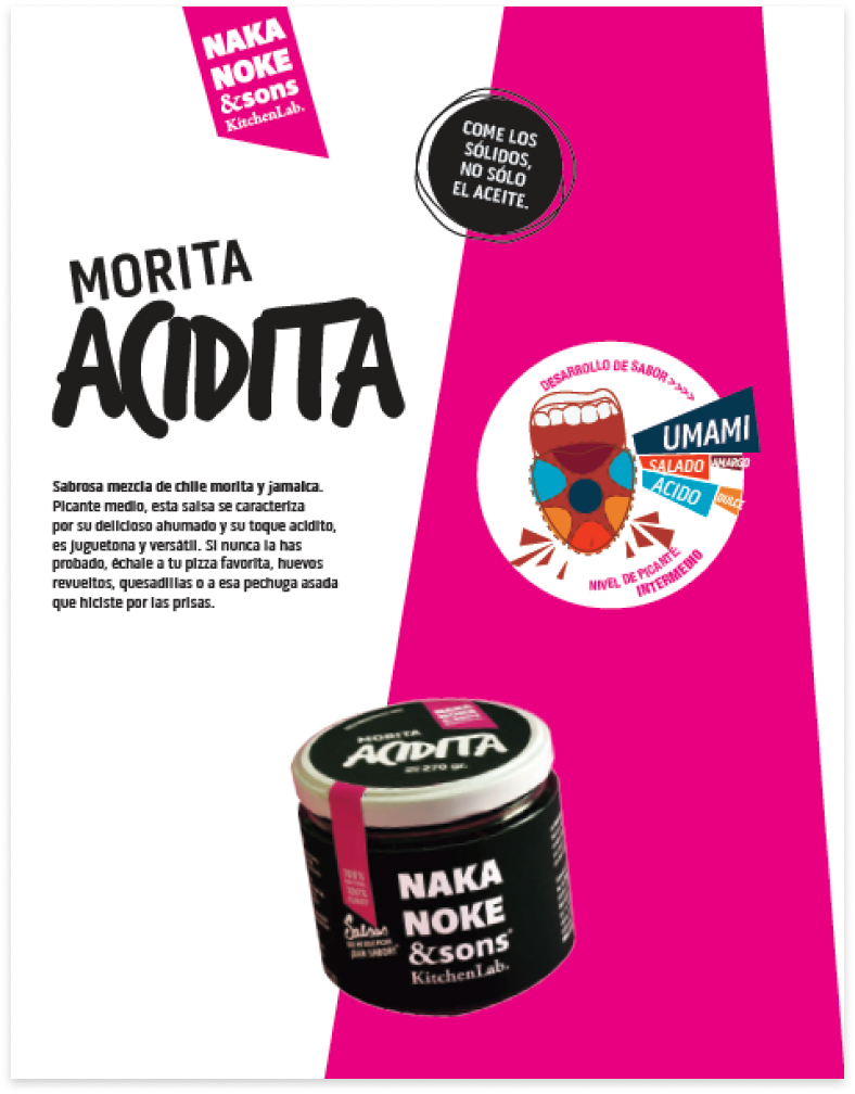
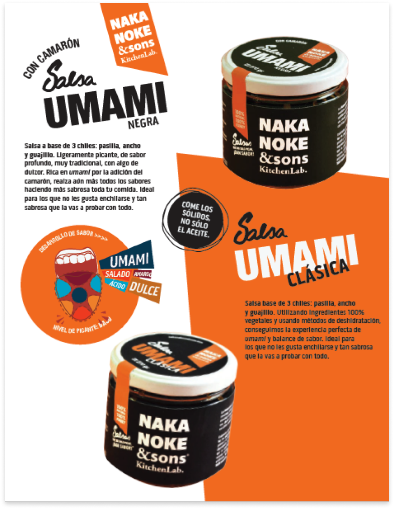
CATALOGUENakaNoke was one of the most innovative pantry products in Mexico City. No salsa before had a comparable name, brand, or flavor profile. We were invited as sponsors for design fairs along with food-and-beverage summits. Because our concept of emphasizing umami (the so-called “fifth taste”) was new in the market, I developed technical sheets providing information in a fun way — complete with infographics and a code of colors to identify the differences between the flavors.
TYPE & COLORHere are a few logos, marketing images, and illustrations that I enjoyed working on — either for the results or the fantastic teams behind them.
For a few years I owned a soup and salad bar called Las Soupremes.
Wind from the east or Tong Poo, a Japanese food pop-up in Mexico City.
A set of icons for the Mexican grocery store M-Esencial.
Logo for LACTEO Network, the Latin American Cheese Training Empowerment & Outreach Network.
Ads for a small producer fair inside Walmart de México.
Signs made for Unilever import product pallets inside retail.
Print collateral materials for a flamenco performance in San Francisco.

